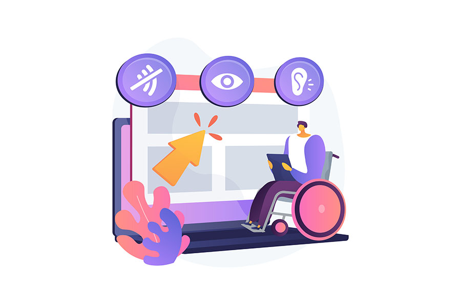
If you are a website developer or a designer, it’s time to consider website accessibility.
Website accessibility is about making websites, tools, and technologies accessible to everyone, including people with disabilities.
There is a growing trend of making websites accessible to people with disabilities.
According to ddiy.co, “97.4% of the world’s top one million websites don’t offer full accessibility.”
That’s quite a staggering stat. The question is, why bother to do so? After all, there are no legal requirements to do so except for government agencies in the USA.
There’s why things get interesting…
In 2018, the spending power of people with disabilities was estimated to be over $490B! That’s a huge hidden market that many websites are forgoing.
W3C and WCAG
In 1999, the World Wide Web Consortium (W3C) started the Web Content Accessibility Guideline, commonly known as “WCAG.” WCAG is a technical document that states the various standard accessibility guidelines.
In Introduction to Accessibility, W3C stated:
“When websites and web tools are properly designed and coded, people with disabilities can use them.”
and that
“Web accessibility encompasses all disabilities that affect access to the Web, including auditory, cognitive, neurological, physical, speech, visual.”
The latest WCAG 2.0 guidelines are organized under four principles: perceivable, operable, understandable, and robust.
Each guideline has three testable levels: A, AA, and AAA. Each level contains a set of minimum requirements that a site must meet.
Screen Readers
There is software today that helps the disabled access webpages, and they are commonly known as screen readers.
Screen readers are software applications for people with visual impairment when using the computer.
In web browsing, the software will help a disabled person to “read” the website and convert the reading to audio. Some of the popular screen readers would be JAWS or NVDA screen Readers.
With the rising use of screen readers, our website structure needs to be more accessible.
Before we go to 5 ways to make our website accessible, let’s quickly understand the difference between website accessibility and digital accessibility.
Website Accessibility vs. Digital Accessibility
Both terms may mean the same thing, but they differ when we look into the detail.
Website accessibility is based on the principle that websites and related technologies should be accessible to all with disabilities.
Digital accessibility has a larger scope, including website accessibility and other digital mediums like video, audio, electronic document, and mobile apps.
In this article, we focus mainly on website accessibility.
Making Your Website For Accessible
There are many guidelines that a website developer needs to follow. And if you are interested to understand all the guidelines, you can read the resources from the Website Accessibility Initiative.
It’s quite a technical reading, but if you want simpler principles or actions, here are some recommended actions to make your website more accessible.
The recommendations are not 100% complete, but they help your website move toward website accessibility standards.
1. Have Descriptive link text
Always ensure that all your links are descriptive. It is not only for SEO purposes but also to ensure that such links are readable for people with lower vision.
For example, which of the following links is more readable?
For more examples of DIY dog training at home, click here.

Be sure to find out more about DIY dog training at home today.
Descriptive text links are important because they give readers an idea of what to expect when they click on the link.
If your web design allows, you can also increase the visibility of these links by bolding the text like:
Be sure to find out more about DIY dog training at home today.
Of course, there is a balance between a useful description text link and the overall design scheme.
There is no need to have a link in bold, bright red, or capitalized font to get the readers’ attention. Similarly, you do not have a link color that is the same as the text (or background) without an underline.
This link is way TOO EXTREME versus can you see any links here?
2. Include Alt text for images
Alt text is a short form for “Alternative text,” it is used as an alternative visual tool in the event an image fails to load.
Alternative text is important for visitors that use screen readers. Without the alternative text, the visitors will not understand what the image is all about.
When you add alt text, you need to be aware of 3 things:
- Be descriptive
You need to ensure that the alt text describes what the image is all about. You can put a picture of a dog resting on a couch with an alt text: “Dog.” An appropriate alt text would be: “Dog resting on a couch.” - Be concise
On the flip end, there is no need to give a long description. It can be very disruptive for the screen readers and may confuse them. It would be best if you looked at a maximum of 140 characters in the length of the text. - Write for users, not for SEO
Alt text has often been used as an SEO tool. Make sure that you use alt text mainly for the readers, not for SEO
Grand Valley State University gave a good article on using alt text. The article stated four types of images and the recommended use of alt text:
- Informative images
Simple images that can be easily explained in a sentence. e.g., “A dog resting on a couch.” - Functional images
Images that require a user to act upon. For example, a play video image button. The alt text should be a simple “Play” or “Play Video” - Images of text
Some images contain text—for example, a logo or a call-to-action image button. The alt text should always have the same words as the image. - Complex images
Images such as diagrams, statistics, or charts. Your alt text should provide an overall description of the image. e.g., “A chart showing tablet sales growth from 2015 to 2020.”
Careful planning of alt text can help improve your accessibility experience.
3. Plan a Well-structured Website
A well-structured website involves good planning of your website content so that it’s easier for your readers to follow.
There are many ways to structure your website content properly, and here are three guidelines you should follow.
Use Header Tags
The simple way to structure your website is to use header tags.
Header tags are HTML code that are coded as <h1>, <h2>, <h3>, <h4>, <h5>, <h6>. The H1 tag is usually the main tag, and the subsequent header tags will work as the sub-headers.
The header tags should be used in sequence, meaning the H1 tag must be used first before the H2 tag.
Proper usage of header tags will help the readers to understand the main topic and the sub-topics.
Keep Your Paragraph Short
Make it easier for your readers to digest your material; the easiest way is to use short paragraphs. Break up your sentences with commas and full-stop where possible.
Paragraphs with long sentences can make the readers feel “breathless.” This is very apparent with screen readers.
In principle, always keep your paragraphs within 2-3 lines. That’s about 30 – 50 words maximum.
Use Bullet Points To Highlight Main Points
If you have information in the form of a list, use bullet points. Bullet points are useful in capturing your readers’ attention and help readers with disabilities easily digest them.
It is important that you should use HTML tag <ol> and <ul> rather than “dash” or “dot.” Screen readers will not be able to differentiate “dashes” from HTML bullets.
In HTML, it should look like this:
<ol>

<ul>List 1</ul>

<ul>List 2</ul>

</ol>
rather than:
– List item 1
– List item 2
If you skim this article, you will realize that our sentences are mostly two sentences long, use bullets, and use a lot of header tags. 🙂
4. Remember Color Contrast Ratios
The color contrast ratio is a ratio that helps distinguish colors for easy reading.
Users with low vision or color-blind may find it difficult to read textual content when:
- The text color and the background color are too close
This text color is too close to the white background color - Over usage of green and red in text content
Users who are color-blind will find this text hard to read
Online tools like Color Contrast Analyzer or Contrast Checker can help you determine if your choice of color fulfills the contrast ratio.
5. Better Accessible forms
Almost every website has an online form. Forms can be tricky for designers and developers in developing forms for people with disabilities.
Here are a few recommended practices for designing forms:
Always label your inputs
Adding placeholder in input fields makes the form looks clean and compact. However, screen readers will find it hard to identify placeholders.
Always add labels to make it easier for users to understand the fields they are at.
Highlight input element on focus
When the user selects the input field, highlight it. That can help the users know where they are on the form.
Provide error messages
If there is an input error, always provide an error message so the user will know and be able to rectify it.
reCaptcha is Accessibility-Friendly
Google provides reCaptcha as a free tool to help combat spam entries. The most common reCaptcha used is reCaptcha v2 and reCaptcha v3.
Google’s Recaptcha v2 used interaction with the user like this:

The good news is that ReCaptcha v2 is accessibility-friendly, where it will automatically provide an audio challenge rather than a visual challenge.
However, Google’s ReCaptcha v3 removes interactivity and uses a score to determine if the user is a human or a bot. Recaptcha v3 might be a better choice for users with accessibility but note that there are some privacy concerns.
As a designer or a developer, you may have to balance the use of captchas with accessibility and privacy.
Conclusion
The five recommended actions are not the complete list but form a good foundation to achieving website accessibility.
In designing or developing your website, make every effort to make the website easier for people with disabilities. They do play a part in participating in the online world.
If you need assistance in this area, Websparks have a team of professional UI/UX specialists who can help you make your website more accessible.
Do speak with us, and we will help you make your website accessible!


